The Previous and Next controls are available for HTML Help, JavaHelp and Help 2.0 targets. The Previous and Next controls are also available for the NetHelp target, in addition to a variety of other controls. See Commands Node (NetHelp Only) for a full description. All of these controls have the following properties:
|
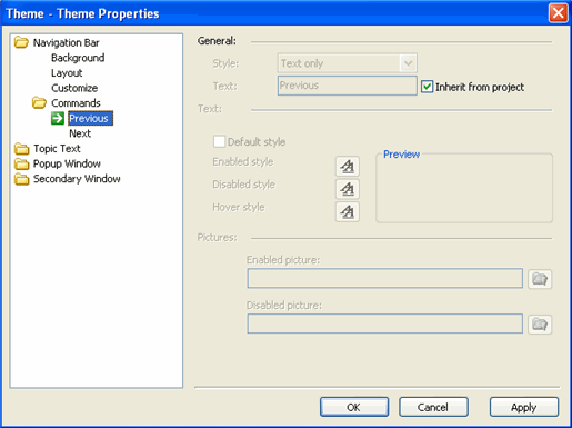
Style |
Defines the Previous navigation as text, image or text and image. |
|
Text |
Defines text for the Previous link. |
|
Inherit from project |
Determines if the Previous link text is inherited from the project. |
|
Default style |
Determines if the Previous link style is inherited from the project. |
|
Enabled style |
Defines the enabled text style for the link. |
|
Disabled style |
Defines the disabled text style for the link. |
|
Hover style |
Defines the hover text style for the link. |
|
Enabled picture |
Defines the enabled image for the button. Note: ComponentOne suggests that any images you want to use should be stored in the following folder: ComponentOne\DocToHelp\Themes\Images\Buttons and Icons |
|
Disabled picture |
Defines the disabled image for the button. Note: ComponentOne suggests that any images you want to use should be stored in the following folder: ComponentOne\DocToHelp\Themes\Images\Buttons and Icons |