The Commands node allows you to modify the formatting of the controls, or buttons and links, in the toolbars of the NetHelp target.
The following controls are available for NetHelp targets. Note that the toolbar location of each command can be changed under the Configuration node of the Toolbars node.
|
Control |
Description |
|
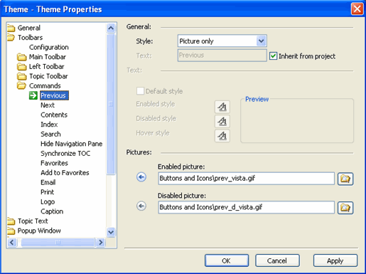
Previous |
The Previous navigation button that appears in the Main toolbar, by default, and jumps to the previous topic, when clicked. |
|
Next |
The Next navigation button that appears in the Main toolbar, by default, and jumps to the next topic, when clicked. |
|
Contents |
The Contents button that appears in the Main toolbar, by default, and jumps to the table of contents, when clicked. |
|
Index |
The Index button that appears in the Main toolbar, by default, and jumps to the table of contents, when clicked. |
|
Search |
The Search button that appears in the Main toolbar, by default, and jumps to the search box, when clicked. |
|
Hide Navigation Pane |
The X button that appears in the Left toolbar, by default, and hides the navigation pane when clicked. The navigation pane can be reopened by clicking one of the navigational panel toggle buttons: Contents, Index, Search or Favorites. Set the HelpTarget.HideNavigationPane property in the project editor to True to hide the pane intially, when the user first opens the NetHelp target. |
|
Synchronize TOC |
The default Sync TOC button that appears when the Synchronize TOC button is added under the Configuration controls in the Toolbars node; when this button is added, authomatic TOC synchronization is disabled. |
|
Favorites |
The Favorites pane appears if the HelpTarget.FavoritesTab is set to True in the project editor and the Favorites button or link is clicked in the NetHelp target. |
|
Add to Favorites |
The Add to Favorites button or link that appears when the Add to Favorites button is added under the Configuration controls in the Toolbars node. When this button or link is clicked in the NetHelp target, the current topic is added to the list of Favorites. |
|
|
The Email button that appears in the Main toolbar, by default. When clicked, the button opens your default email program, creates an email with a link to the current topic, and allows you to finalize the text and send the email. The initial email subject line and address are customizable. See The Message Files Commands (NetHelp Only) for more information. |
|
|
The Print button that appears in the Main toolbar, by default, and prints the topic when clicked. |
|
Logo |
The Logo text and/or picture that appears in the Main toolbar, by default. The Action property described below determines what happens when the Logo is clicked. |
|
Caption |
The Caption text and/or picture that appears in the navigation pane. The Action property shows the name of the navigation tab currently selected by the user. |
The following properties can be set for each control:
|
Style |
Defines the Commands controls as text, image or text and image. |
|
Text |
Defines text for the Commands controls' links. You may choose to use the variable %LeftPaneCaption% in the text to show the caption of the currently selected navigation pane, either Contents, Index, Search or Favorites. For example, if a button's text is "This is the %LeftPaneCaption%", and the Contents tab is selected, "This is Contents" will be displayed. When the Index tab is selected, "This is Index" will be displayed. The %LeftPaneCaption% variable is used in the default theme's Caption command control. |
|
Inherit from project |
Determines if the button or link text is inherited from the project. |
|
Default style |
Determines if the button or link style is inherited from the project. |
|
Enabled style |
Defines the enabled text style for the button or link. |
|
Disabled style |
Defines the disabled text style for the button or link. |
|
Hover style |
Defines the hover text style for the button or link. |
|
Enabled picture |
Defines the enabled image for the button or link. Note: ComponentOne suggests that any images you want to use should be stored in the following folder: ComponentOne\DocToHelp\Themes\Images\Buttons and Icons |
|
Disabled picture |
Defines the disabled image for the button or link. Note: ComponentOne suggests that any images you want to use should be stored in the following folder: ComponentOne\DocToHelp\Themes\Images\Buttons and Icons |
If a custom button was added in the Configuration node of the Toolbars node, it will appear under the list of Commands controls. For example, the built-in NetHelp themes have two custom commands: Logo and Caption. You will notice these in the list of Commands. These commands will have all of the properties listed above, just as other clickable commands like Email have, but they also have one additional property: Action.
|
Action |
Defines the string value of the 'href' attribute of the <A> tag which reacts when the custom button is clicked. If you want to open a topic or an external Web page, enter a URL here, http://www.doctohelp.com, for example. If you want to execute a script, enter a JavaScript here, as it is done in the 'href' attribute of an <A> tag in regular HTML code. |