|
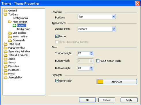
Position |
Places the toolbar either at the top or bottom of the pane where it is located. The Main toolbar is at the top or bottom of the page. The Left toolbar is on top or at the bottom of the navigation pane. The Topic toolbar is at the top or bottom of the topic area. |
|
Appearance |
There are two appearance options: Modern and Classic. The Modern toolbar has rounded edges and semi-transparent buttons for button groups that have a border. The Classic has sharp edges and the standard toolbar look. |
|
Border |
Determines whether the toolbar has a border. |
|
Three-dimensional buttons |
This option is for the Classic Appearance only. The buttons will show a 3D effect when the mouse is hovered over them and when a toggle button is selected. |
|
Toolbar height |
Specifies the height of the toolbar. |
|
Button width |
If the Fixed button width checkbox is unchecked, the width of a button is determined by its picture or text; otherwise, the width is fixed and can be specified using the arrows. |
|
Button height |
Specifies the height of a button inside the toolbar. The difference between the toolbar height and the button height determines the vertical distance from toolbar border to button border. |
|
Hover color |
Defines the hover color for the buttons. Click the button to the right to access color palettes. |