|
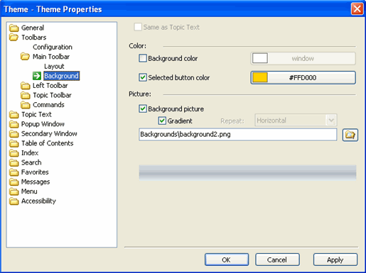
Same as Topic Text |
Sets the toolbar's properties so they are inherited from the project settings. |
|
Background color |
Defines the color in the toolbar area. Click the button to the right to access color pallets. |
|
Selected button color |
Defines the color of a button once it has been clicked. |
|
Background picture |
Defines the background image in the toolbar area. Click
the browse button |
|
Repeat |
Defines where the image will appear in the background. This option is only available if the Gradient checkbox is unchecked. |
|
Gradient |
When selected, the background picture for the gradient
can be specified, and it must be one pixel wide. To specify a picture for
the gradient, click the browse button |
 to access the
image directory. Note: ComponentOne suggests that any images you
want to use should be stored in the following folder:
ComponentOne\DocToHelp\Themes\Images\Backgrounds.
to access the
image directory. Note: ComponentOne suggests that any images you
want to use should be stored in the following folder:
ComponentOne\DocToHelp\Themes\Images\Backgrounds.